Mimi’s Cookies
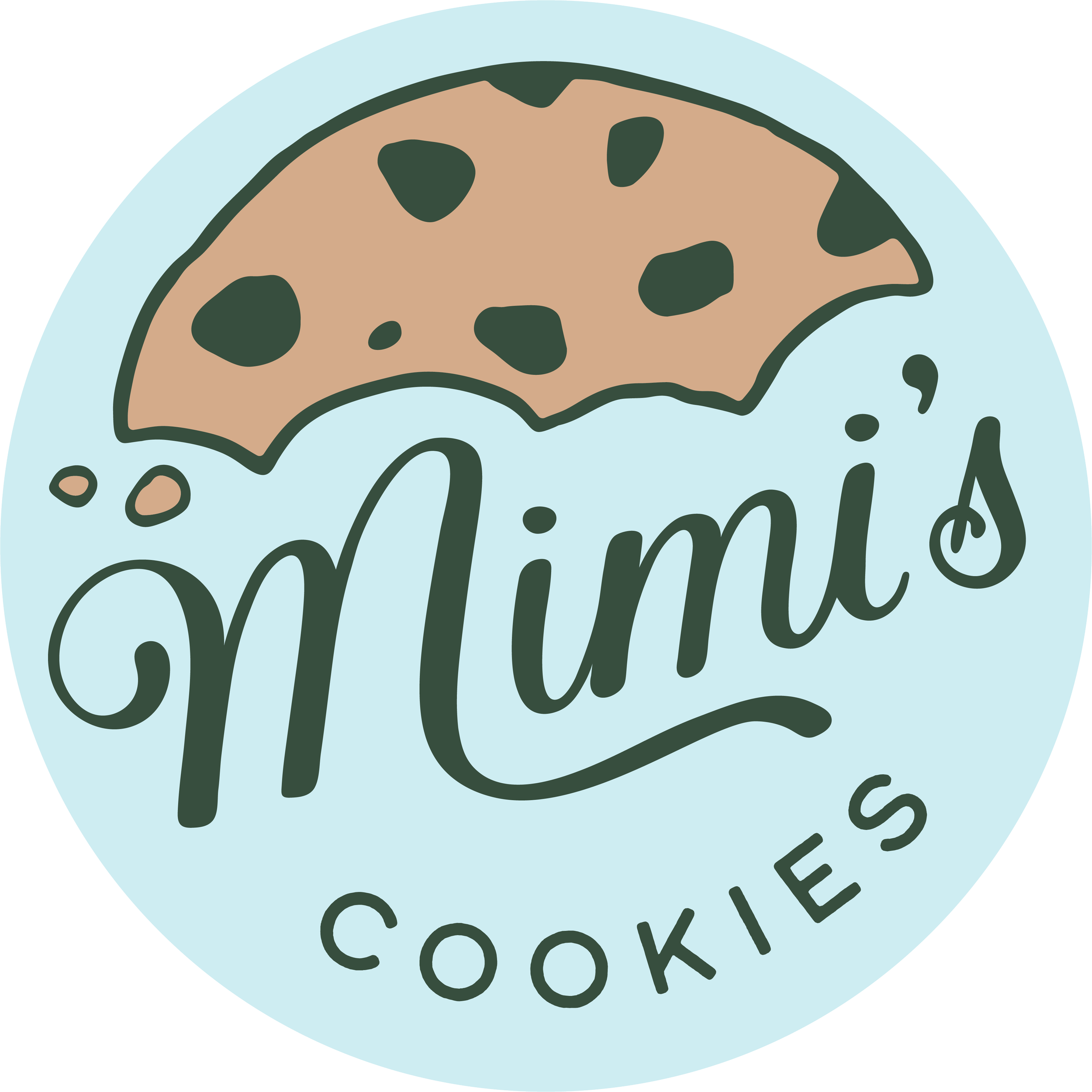
I designed a logo for Mimi’s Cookies, a small, family-run bakery specializing in homemade, seasonal cookies—especially around the holidays. The goal was to create a warm and inviting brand identity that would make a strong first impression in local advertising efforts, such as flyers distributed at school and through word of mouth. The final logo reflects the friendly, homemade charm of the business, while remaining versatile enough to adapt to various holiday themes throughout the year.
Services
Branding & Logo Design
Sketches in Procreate
To reflect the friendly and welcoming nature of the brand, I explored flowy, handwritten type styles that felt personal and playful. Since "Mimi" is the name her grandchildren call her, I wanted the logo to carry a sense of warmth and familiarity—something more fun and lighthearted than formal or corporate. This direction helped set the tone for a brand identity that feels both homemade and heartfelt.

Client Feedback
After sending the initial logo drafts to the client, they were especially drawn to options 1, 3, and 9—favoring option 3 overall, but preferring the font used in option 6. With that feedback in mind, I returned to the drawing board to refine the concept, combining their favorite elements to better capture the look and feel they envisioned for Mimi’s Cookies.

Refining the Design
To create a more cohesive and polished logo, I focused on integrating the cookie illustration with the typography. I adjusted the bite marks to align more naturally with the flow of the wordmark, helping the elements feel more connected. To further unify the design and reinforce the cookie concept, I curved the word "COOKIES" along the bottom edge of the circle, giving the logo a more complete and balanced appearance—like a full cookie with character.

Color Variations
Because Mimi’s Cookies focuses heavily on holiday-themed offerings, I created multiple color variations to reflect different seasonal moods. The original tan version serves as the primary logo, while additional palettes—pink for Valentine’s Day, blue for springtime, and green for Christmas—allow the brand to stay festive and relevant year-round. The circular shape of the logo also lends itself perfectly to sticker applications, making it ideal for packaging on cookie boxes and other promotional materials.


